Make a chart#
Select at least two rows, choose Generate Chart, and see how the tool picks a chart type from your columns.
A chart starts from a selection in a results table. You select the rows, and the chart plots the numeric columns in them. The more rows you select, the more of the data the chart draws.
Select the rows to plot#
Select at least two rows in the table. Right-click to open the context menu, then select Generate Chart. In the Database Client results grid, selection works cell by cell, so highlight a block of cells that spans at least two rows.
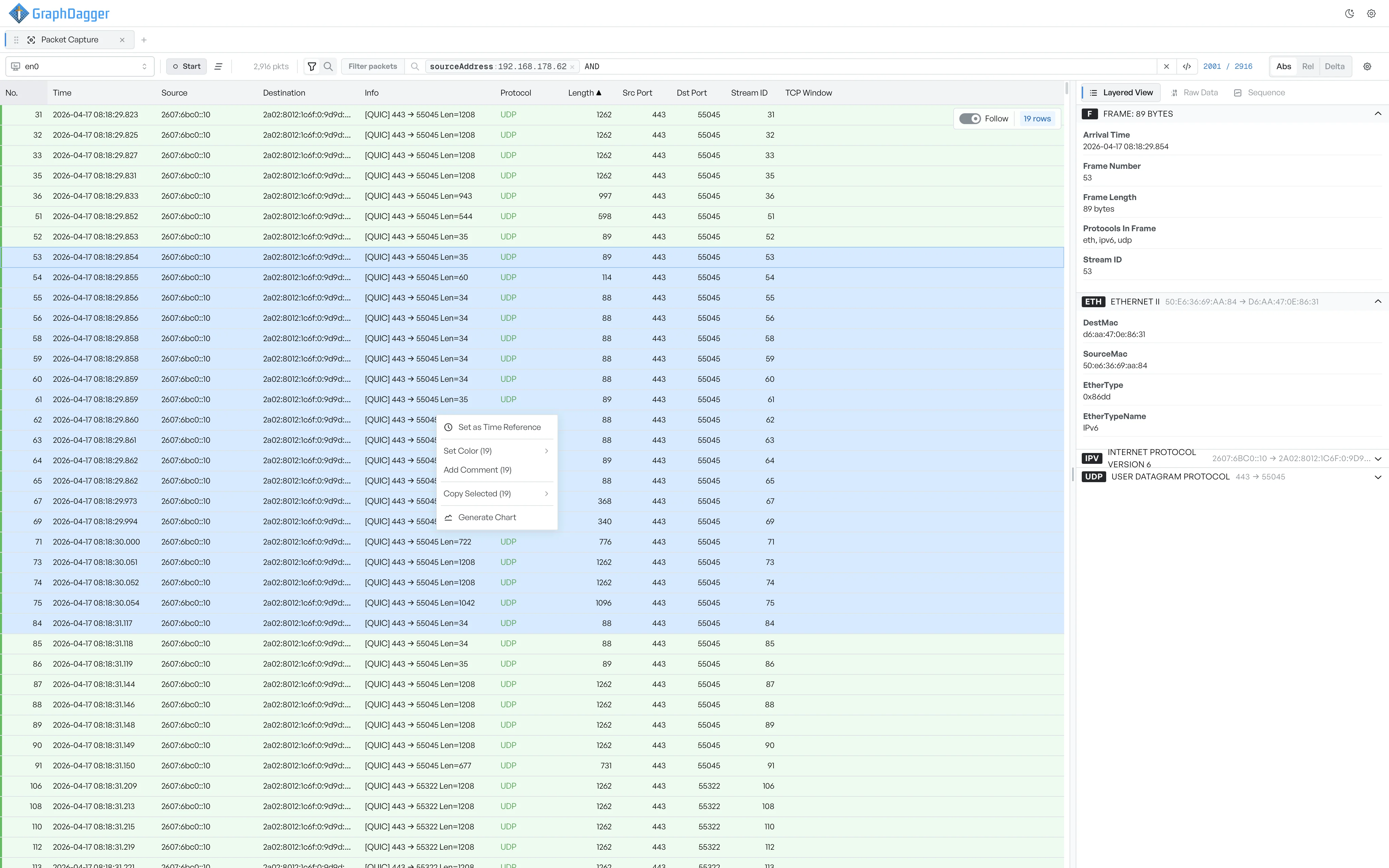
Generate Chart appears in the menu only when you select enough rows. A single row does not give the chart two points to draw between, so the menu hides the option until you widen the selection.
The chart window opens as soon as you select the option, and it plots the numeric columns from your selection. The title of the window names the columns on the plot, for example the length and port columns from a set of packets.
How the chart type is chosen#
You do not select a chart type first. The tool reads the columns you selected and chooses one for you:
- If one column holds times or dates, that column becomes the horizontal axis. The tool draws the numeric columns against it over time. It draws a single numeric column as a filled area, and several numeric columns as lines.
- If the leading column holds text categories rather than numbers or times, you get a bar chart with one bar per category.
- If every column is numeric and no column holds times, the tool plots the values in the order you selected the rows, or it makes the first numeric column the horizontal axis.
The type is a starting point, not a fixed choice. You can switch between line, area, and bar at any time from the chart window. You can also change which columns drive each axis from the customise panel.