Customise a chart#
Open the gear panel to set the plotted columns and change the look of the lines, points, and axes.
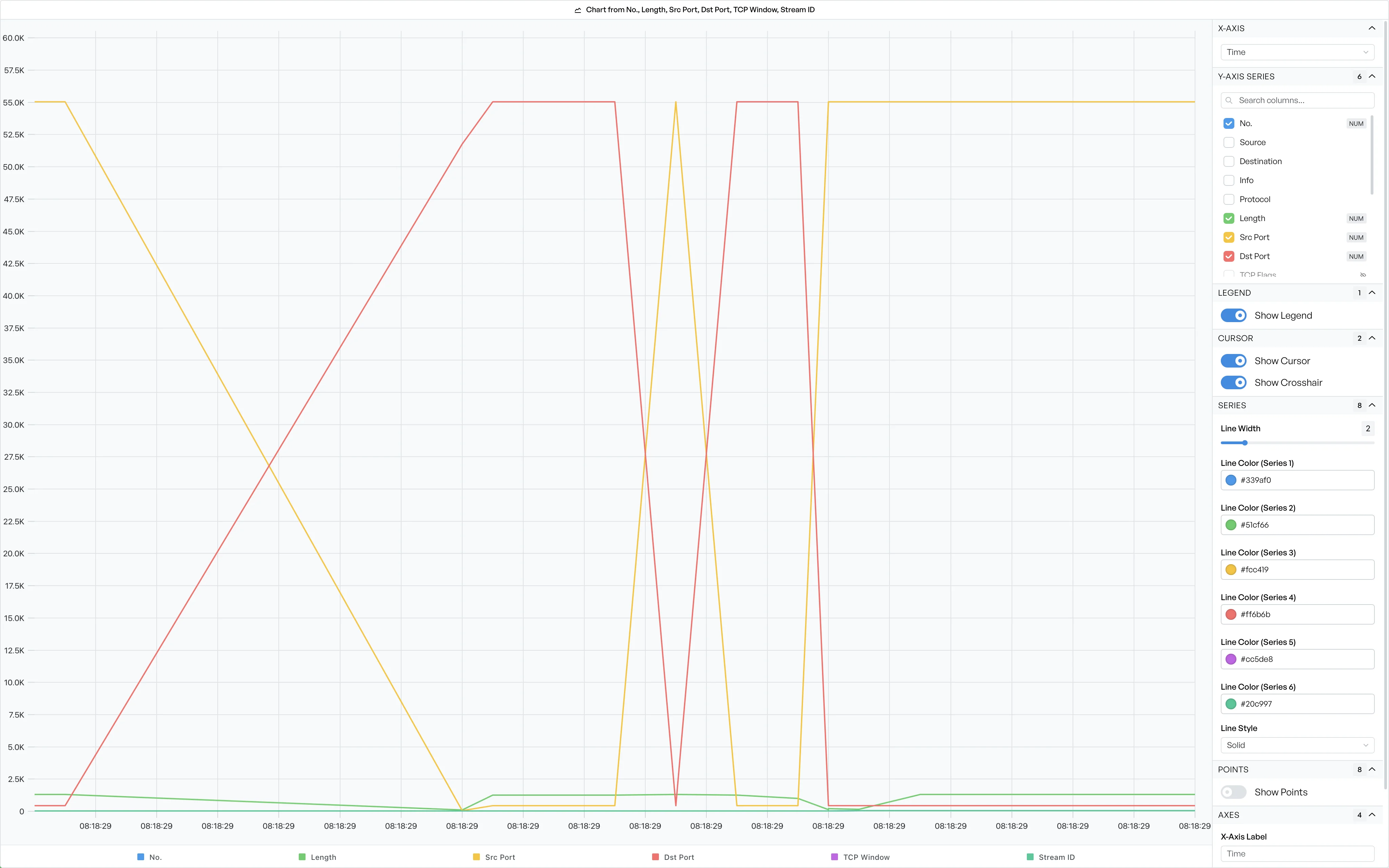
The gear icon in the chart window opens a panel beside the plot. The top of the panel sets the data on the plot. The rest of the panel sets the look of the chart. The chart applies each change as you make it, so the plot updates while the panel is open.
Set the axes and series#
Two sections set the data on the plot.
X-Axis sets the column along the bottom. The list shows every column from your original selection. It also has a Row Index option, which plots the rows in the order you selected them. Select Row Index when no column makes a natural horizontal axis.
Y-Axis Series sets the columns that the chart draws as lines, areas, or bars. Each column has a checkbox. Tick a checkbox to plot that column, and untick it to drop that column. A small tag marks the columns that hold times or numeric values. A search box filters the list when there are many columns. You cannot remove the last series, so the plot always has something to draw.
The panel offers every column from the source table, including the columns hidden in that table. A mark identifies the hidden columns. When you plot a hidden column, the source table shows that column again. The chart and the table stay in step.
Note Changing the axes or series resets any styling you have applied, because the set of plotted lines has changed.
Change the chart style#
Below the axis controls, more sections change the look of the chart. The sections depend on the chart type, but they cover the same ground: the legend and the hover cursor, the width, colour, and style of the lines, the data points, and the axis labels and gridlines. Bar and area charts show the options that suit them, such as bar width or fill.
The style belongs to the open chart only. The app does not save it. When you close the window and generate the chart again, the chart starts from the defaults.