Group fields into a chart#
Count or measure any field, group by one or more others, then draw the same aggregation as a table, line, area, bar, or scatter chart.
The Group into control on the query bar decides how Log Explorer rolls up the current result set. The default mode, Fields, aggregates by one or more fields. It then renders the aggregation as a table, line, area, bar, or scatter chart. This page covers the Fields mode. The other two modes, Patterns and Transactions, have their own pages.
Set the metric and grouping#
Switch Group into to Fields. A row of controls appears to the right:
- Show chooses the metric.
Count of of all logsis the default. It counts rows in each group. The Σ button opens the list of other metrics you can pick, such as sum, average, minimum, or maximum over a numerical field. - by chooses the grouping fields. Pick
cs_username, for example, to get one row per user. Use the + button next to by to add more grouping fields.
The + between Show and by adds a second metric, so you can plot two series at once.
Visualize as#
After you define the aggregation, use the Visualize as row above the result to pick how Log Explorer draws the data. The same aggregation renders into every chart type without a new query, so you can switch back and forth as you explore.
Table#
The table view shows each group as a row with one column per metric. It is the default view and the best way to read exact values.
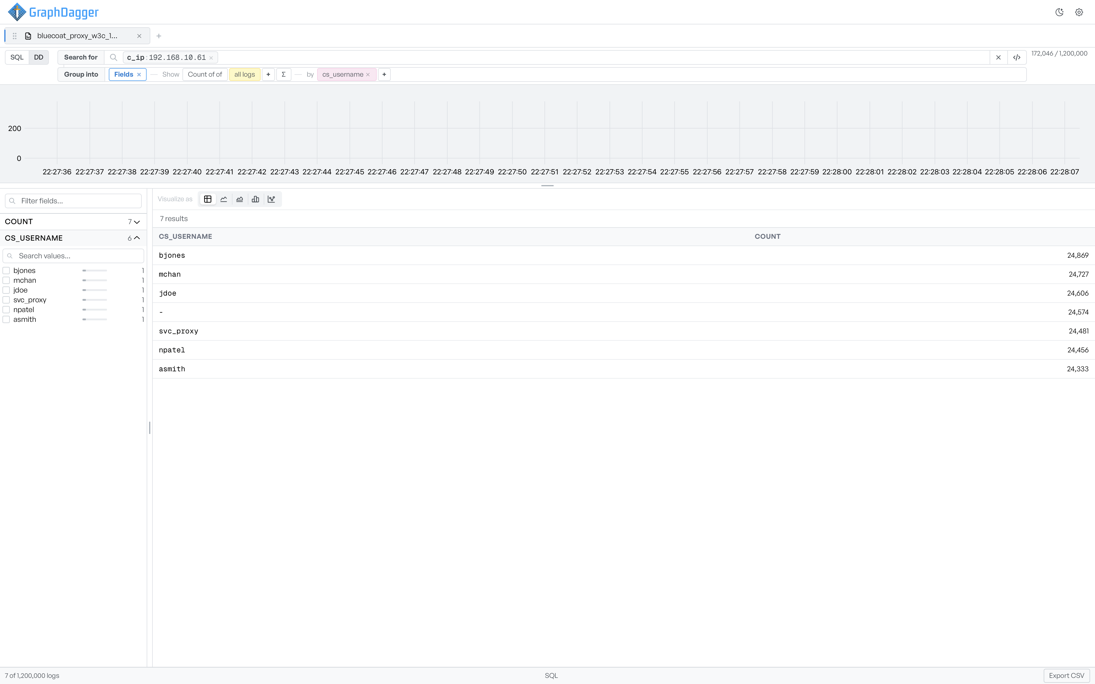
- Select a column header to sort. A small arrow shows the direction.
- Export CSV in the bottom-right writes the visible rows to a CSV file.
Bar#
The bar view draws one vertical bar per group. Hover over a bar to see the group label and metric value.
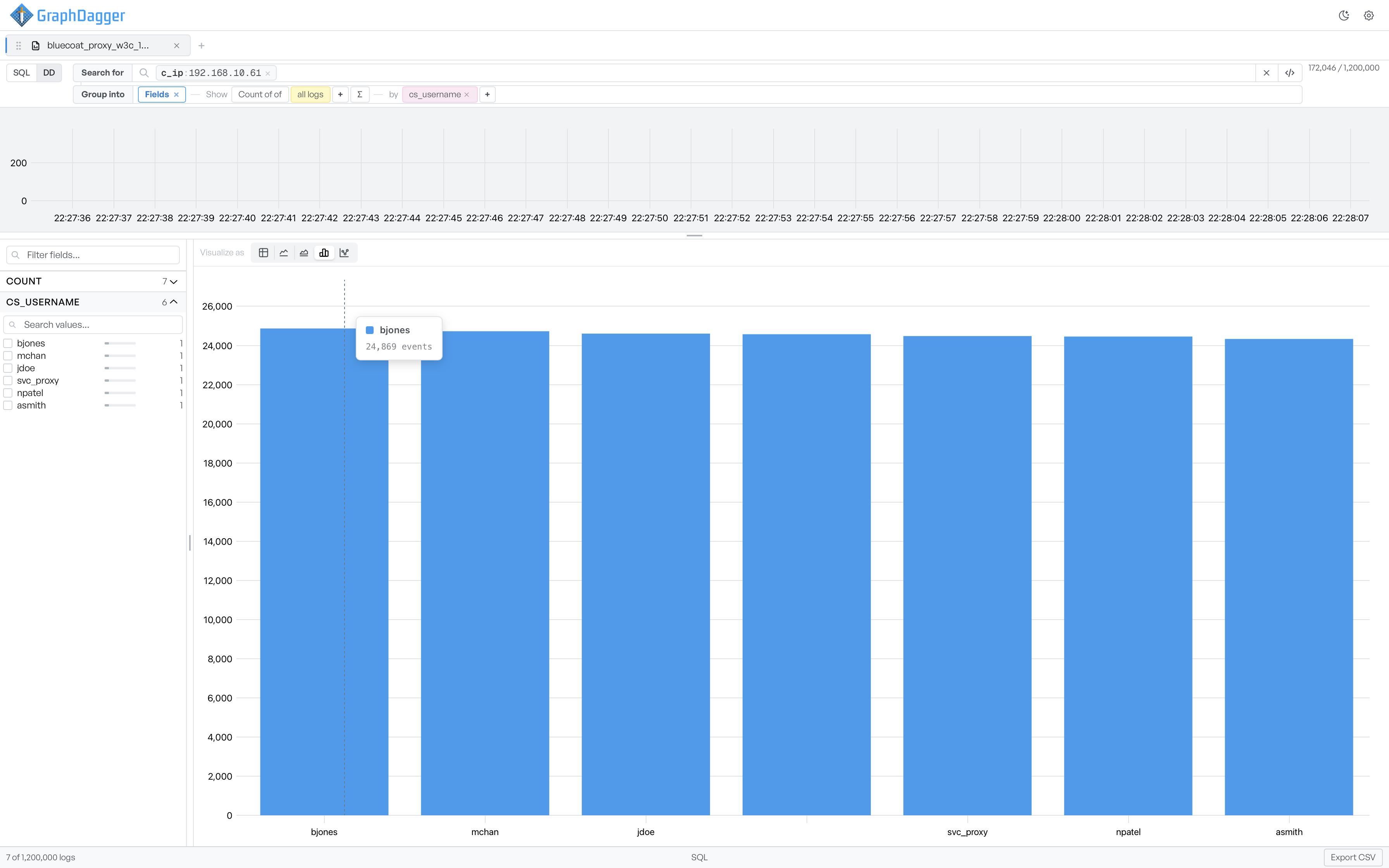
Bars are best when you compare the size of a small number of groups.
Line#
The line view connects the metric value for each group with a single line.
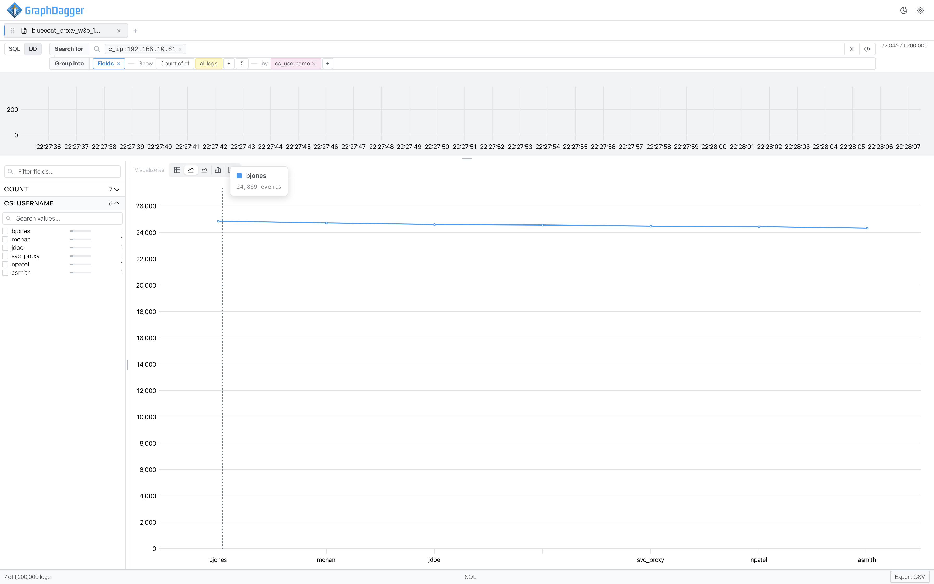
Lines work well when the grouping field has a natural order, for example a timestamp bucket. They also work well when you want to read a trend across groups.
Area#
The area view is a line chart with the region underneath filled in.
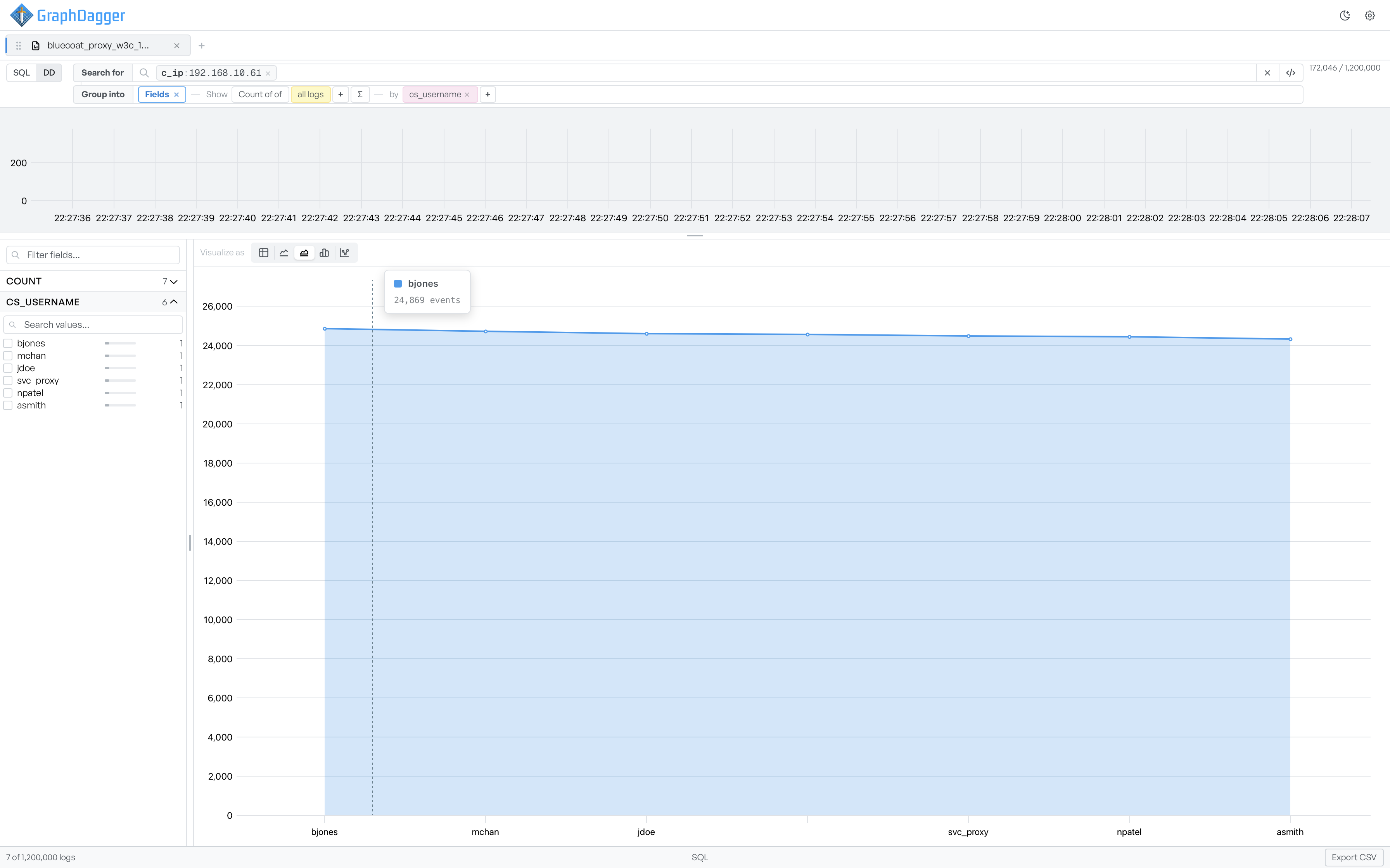
Use the area view when you want to emphasize cumulative magnitude.
Scatter#
The scatter view plots one point per group at the metric value.
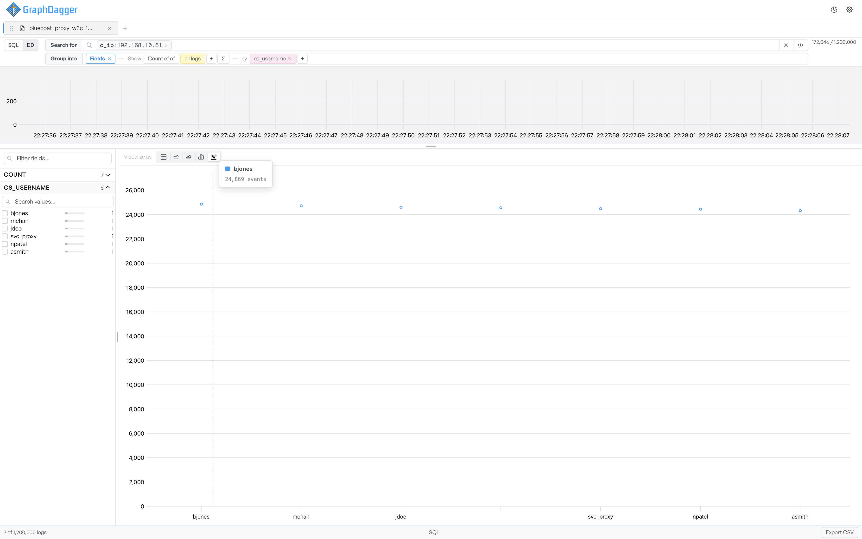
Scatter helps when you want to see how closely the values cluster, without a connecting line that implies an order.
Read the histogram beside a chart#
The activity histogram still reflects the active query in a visualization view. It is a time series of the matched rows, whatever the grouping. You can therefore watch when the matched events happened while the main area shows the aggregated breakdown.
Return to the events table#
To return to the per-event list, switch Group into back to the field list without a grouping. You can also remove every grouping and metric. The events table returns to the main area and the visualization selector hides.