Show a result as a chart#
Swap the results grid for a bar, line, area, scatter, pie, or single-figure view of the same rows.
You can chart any SELECT result without leaving the editor. A chart turns a grid of numbers into a picture: totals over time, a breakdown by category, a single headline figure. The chart reads the rows already returned, so there is nothing extra to run.
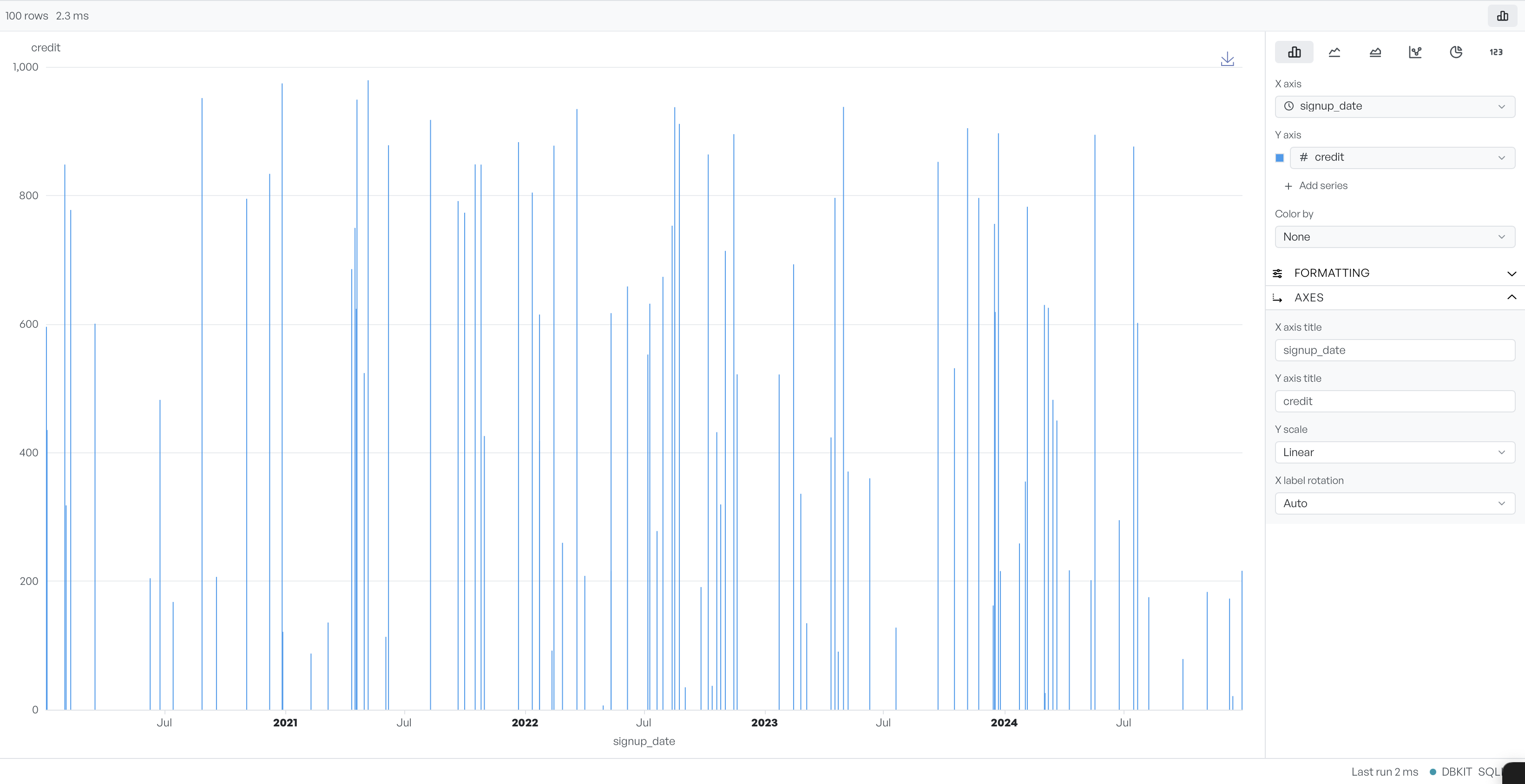
Run a query, then select the chart button above the results to switch the grid for a chart. The chart fills the space, and a configuration panel opens beside it. Select the button again to return to the grid.
Pick a chart type#
The type buttons offer Bar, Line, Area, Scatter, Pie, and Big Number. Big Number shows a single value rather than a plot. It suits a query that returns one figure, such as a total or a count.
Set the axes and series#
You then select which columns the chart uses. Pick a column for the X axis and one for the Y axis. Bar, line, and area charts take more than one Y series, so you can plot several measures together. Use Add series to add another. Colour by splits the data into coloured groups by a column's value, and a scatter chart adds a size channel.
The Formatting and Axes sections tune the look: axis titles, a linear or logarithmic scale, and the rotation of the axis labels. When the chart is ready, the download button saves it as an image.