Read the address timeline#
Follow when each address sent or received traffic, against a packet histogram across the top of the plot.
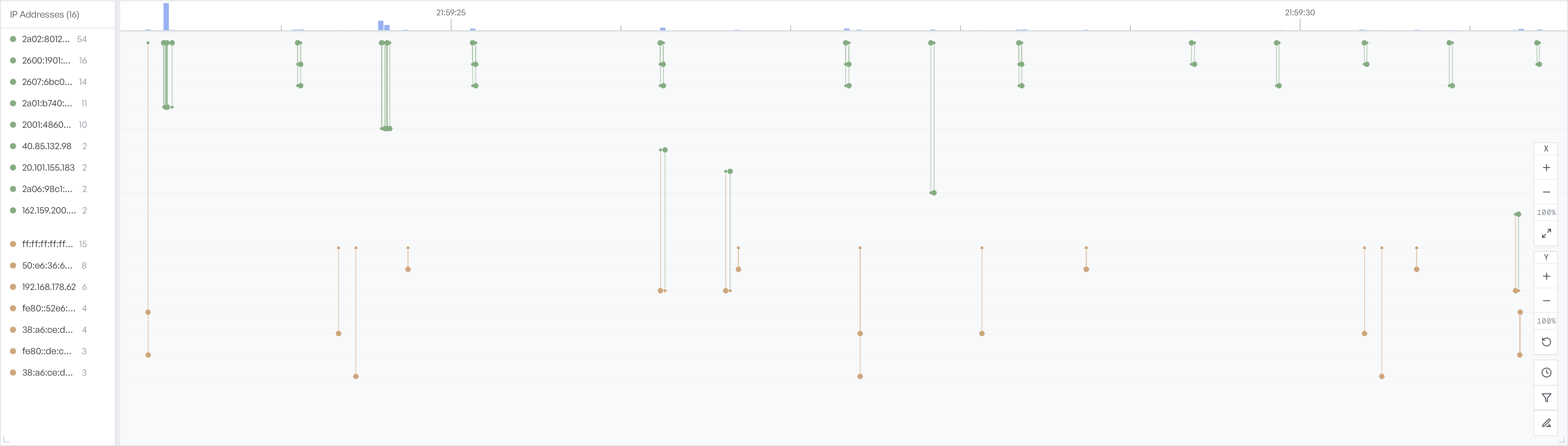
The timeline at the bottom of the Forensic Timeline view shows an address-by-time view of the capture. Both the Network Graph and Connection Table tabs share it, and it stays visible as you switch between them.
The three timeline regions#
The timeline has three regions:
- Address list: every IP address in the capture, with a running packet count next to each.
- Histogram: overall packet volume across the same time window.
- Plot: one row per address, with traffic between addresses drawn as coloured points and lines over time.
Coloured dots mark when a particular address sent or received a frame. Vertical lines connect dots from related addresses, so you can read the timeline as a series of conversations rather than a per-address strip.
Read the histogram above#
Use the histogram to spot bursts and idle periods at a glance. Then follow a burst down into the per-address rows to see which addresses caused it.
A spike that lights up many rows is a wide event that affects several pairs, for example the start of a page load that fans out to many backends. A spike that lights up two rows is a single busy pair.
Highlight from the other tabs#
Select a row in the Connection Table to highlight the two endpoints in the timeline. The highlight shows exactly when that pair exchanged traffic. Select a node in the Network Graph to highlight its row in the same way.
Pan and zoom the plot#
Drag the plot horizontally to scroll through time. The X and Y zoom controls on the right edge change the scale on each axis independently. Use the X axis when you want to focus on a narrow time range. Use the Y axis when many addresses are stacked together and you need to read individual rows.
The reset icon under the zoom controls returns the plot to fit-the-capture defaults.